Brand Toolkit
Consistent use of university brand elements makes messages from Murray State more recognizable and meaningful. Learn the basics of Murray State's brand including our mission, key messaging, pillars and personality traits.
-
Centennial toolkit - new for 2022 (available for members of the campus community)
Our Brand Promise
Murray State University provides a collaborative, opportunity-rich learning community that engages then empowers students with a real-world education that fosters personal growth and professional success.
Brand Pillars
-
Inspiring faculty and staff committed to student success.
-
Our distinctive campus community: Racer family.
-
Intentional experiential pathways to the future.
-
Our service area and beyond: an extended classroom.
Brand Personality
Earnest. Inspired. Determined. Doer. Creative. Leader. Partner.
The Logo

The Murray State logo embodies our identity and assures audiences of a strong connection to the university. Typeset in FreightText Bold and FreightSans Book paired with our shield, our logo is the central element from which all our visual elements are drawn. When used as a logo (and not embedded within text) the official vector artwork should be used.
Please follow guidelines to ensure the logo retains its impact as the official mark of Murray State.
Tagline
The "We are Racers" primary brand messaging is intended to be a unifier for both the campus and greater community while supporting the brand promise and mission of the University.
The "We are Racers." brand messaging is intended to be a unifier for both the campus and greater community while supporting the brand promise and mission of the University.
The "We are Racers." messaging can be used by following these guidelines:
-
Choose words only from the approved word bank. Words should remain lowercase. You may list 1 or 2 "We are" statements before the "We are Racers." statement.
-
The "We are Racers." statement is always used last.
-
"Racers" is always capitalized while "are" is never capitalized. There is an exception to this rule when using hashtags; #WeAreRacers is the proper format.
-
Never abbreviate the tagline (W.A.R.).
-
Each statement always ends with a period.
Download FreightText Medium font.
3 statement format example
We are {insert word from word bank}.
We are {insert word from word bank}.
We are Racers.
2 statement format example
We are {insert word from word bank}.
We are Racers.
The word bank is updated when new words are added.
Examples of proper use
3 statement format
We are caregivers.
We are nurses.
We are Racers.
2 statement format
We are nurses.
We are Racers.
Examples of improper use
-
Do not use more than three statements or reformat statements.
We are caregivers.
We are dedicated.
Racers are nurses.
We are Racers. -
Do not use additional words. Each statement should be three words in length.
We are caregivers.
We are very dedicated.
We are Racers. -
Do not use unauthorized words or punctuation.
We are cool!
We are hip!
We are Racers! -
Do not use other fonts or styles.
We are caregivers.
We are dedicated.
WE ARE RACERS.
Tagline and lock-up
Tagline

Lock-up logo

If you are not using the messaging, you may choose to use the tagline or the lock-up logo.
The tagline and lock-up logo can be used by following these guidelines:
-
When only using the tagline, an official logo should be present.
-
To avoid redundancy, only use one "We are Racers." element (messaging, tagline or lock-up logo) should be used.
-
Never abbreviate the tagline (W.A.R.).
-
Use correct font and downloaded materials.
Improper use

Proper use

Identity
Any marketing materials representing the University, from brochures to web pages to press releases, should follow Associated Press style for grammar. We encourage you to save the following style guide and/or hang it up at your desk for easy reference. Not only will it make great office decor, it will also help ensure consistent grammar usage across the University.
Download the University's Editorial Style Guidelines
For more tips on AP style, Purdue OWL and Grammar Girl are great resources. If you have further questions, please contact the office of branding, marketing and communication at msu.pr@murraystate.edu.
Important note: Please use the official names of University colleges, buildings and scholarships, and check your spelling. Examples include the Arthur J. Bauernfeind College of Business, Susan E. Bauernfeind Wellness Center and Jesse D. Jones College of Science, Engineering and Technology.
Any promotional or marketing material that represents any aspect of the University is required to have an equal opportunity statement. The shortened version is easiest to include and can be placed in the footer of the publication in a small font. The font should be no smaller than 6 points with enough contrast to be legible.
Equal Opportunity Statement
Long version:
Murray State University endorses the intent of all federal and state laws created to prohibit discrimination. Murray State University does not discriminate on the basis of race, color, national origin, sex, gender identity, sexual orientation, religion, age, veteran status, disability, or political or social viewpoint in employment or application for employment, admissions or the provision of student and employee services and provides, upon request, reasonable accommodation including auxiliary aids and services necessary to afford individuals with disabilities equal access to participate in all programs and activities.
Shortened version:
Murray State is an Equal Opportunity Employer/AA. Murray State University supports a clean and healthy campus. Please refrain from personal tobacco use.
The University’s Typeface
The Freight font family is the official University typeface. The serif font should be used for headlines and subheads, and the sans serif version should be used for body copy.
These fonts are pre-installed on University-owned Windows machines. Mac users can download and install these fonts to their own profiles.
If you have questions about using these fonts on University computers, contact the Service Desk at 270.809.2346 or msu.servicedesk@murraystate.edu.
Primary
There are two primary colors, the tried and true Murray State blue and gold.
 Name: MURRAY STATE BLUE
CMYK: 100, 90, 0, 70
RGB: 0, 33, 68
PMS: 289
HEX: 002144  Name: MURRAY STATE GOLD
CMYK: 0, 24, 94, 0
RGB: 236, 172, 0
PMS: 123
HEX: ECAC00
Accent
The accent colors are the University's secondary colors. These should be used sparingly.
 Name: LITE BLUE
CMYK: 83, 11, 2, 0
RGB: 0, 164, 227
PMS 2995
HEX: 00A4E3  Name: RED ORANGE
CMYK: 0, 87, 80, 0
RGB: 255, 69, 0
PMS: Pantone warm red
HEX: FF4500
Use of the department logo system is required for all academic and administrative units. To request your department logo, please contact Branding, Marketing and Communication. Modifications are not permitted, but this system provides variations for certain circumstances. To display a unit name, a single or double line of text is inserted. The font FreightText semibold is used with a cap-height of the unit name being equal to the x-height of UN I V E R S I T Y.
Contact Melissa Shown at mshown@murraystate.edu to request a logo for your department.
Single line logo

Double line logo

Video
:30 Commercial
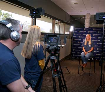
Videography plays a huge role in bringing a branding message to life while sharing Murray State's story in a compelling way. For additional information or to schedule a videographer, please contact the Digital Media Services team within the Office of Branding, Marketing and Communication.
Best practices
-
Animation: To maintain brand consistency, all videos representing Murray State University should end with the same video animation. View/download video animations.
-
Captions: To comply with the University’s accessibility policy, all Murray State videos must have closed-captioning capability. These can be turned on and off at the discretion of the viewer on uploads to Facebook and YouTube. These should be in a plain text (.txt or .srt .txt) format for uploading to YouTube and Facebook. YouTube can automatically create captions that can then be edited and downloaded in plain text format.
-
Music: Videos must only use music for which they have all necessary permissions. Copyrighted music may not be used in any Murray State video without permission from the creator. Many websites and musicians supply high-quality music without copyright for use in any video, for free, for free with accreditation or for a small fee.
The University’s Image
Photography is a key element of our brand. We’re capturing the essence of Murray State through a visual medium. Using a contemporary style, we’re capturing diversity, candid moments and the students and faculty in their academic settings.
Photo shoots and downloads
For copyright information or to schedule a photographer, please contact the digital media team within the Office of Branding, Marketing and Communication at msu.photography@murraystate.edu. View/download images on SmugMug.
Best practices
-
Print: CMYK color format, TIFF, PSD, or JPEG at 300 dpi
-
Web/Digital images: RGB Color format, JPEG or PNG ranging from 72 dpi to 300 dpi
-
As a general rule, low resolution images lose quality if they are resized larger than their original size.
-
Never use photos that are pulled from the internet without having proper permission or rights.
-
Do not use colorizing or apply dramatic filters to photos.
-
Do not crop an image so severely that the subject or emotion is compromised.
-
Do not use outdated photographs of campus.
-
Alt text for web and pdf
Image alt text (alternative text) is used within HTML code to describe the appearance and function of an image on a web page. This should also be applied within the settings of a .pdf document if it will be available online. Alt text is a central principle of web accessibility. Visually impaired people using screen readers read alt text to better understand the image, and it also provides context to search engines, helping to index an image properly. When writing alt text, describe the image as specifically as possible, but keep it short.
-
Download Zoom backgrounds - If your Zoom background image appears reversed on screen, de-select the "Mirror my video" option.
Communication Materials
Letterhead and business card pricing and ordering information is available via Print Services.
Letterhead example

Horizontal business card example (not actual size)

Vertical business card example (not actual size)

Powerpoint Templates
Format Excel files
To create a Murray State theme using the official colors:
-
Open a new Excel document.
-
Go to the Page Layout tab. Next to Themes, click Colors, then select Create New Theme Colors at the bottom of the list.
-
For each of the desired fields, click the dropdown and then click More Colors.
-
Select the Custom tab, then enter the RGB values for the Murray State colors.
-
For Light Blue (007eb2)
R = 0
G = 126
B = 178 -
For Navy (002144)
R = 0
G = 33
B = 68 -
For Gold (ecac00)
R = 236
G = 172
B = 0 -
Once you've entered a color once, it will appear in the Recent Colors box if you decide to repeat it.
-
-
Once all of the theme colors are selected, click Save.
-
Click Themes, then select Save Current Theme. Name the theme (I used MurrayStateTheme) and save it.
-
Open the document to which you wish to apply the theme. Go to Page Layout and select the theme from the list. This should update any document, or set up any new document with the correct colors. You can also add specific fonts and effects to the theme if you don't like the standard ones and they'll transition in the same way.
Report Cover Templates

Download Report Cover A Word template.
 Download Report Cover B Word template.
 Download Report Cover C Word template.
Agenda Templates
Download Agenda A Word template.

Download Agenda B Word template.

Download Agenda C Word template.
Signoff Design
Ensure your emails feature Murray State branding by updating your signature to look like this:

Signatures should include
-
Name
-
Title/Position
-
Office/Department
-
Campus
-
Phone/Fax
-
Link to apply webpage
-
Logo or lock-up logo
Instructions
-
Download the Murray State logo or the lock-up logo.
-
Click on the gear icon in the upper right corner of your RacerMail inbox.
-
Choose the “Settings” link.
-
In the “Signature” section, click the “Insert Image” icon to upload the new Murray State logo.
-
Reference the design above to update your information as needed.
-
To link the Apply Today text, click the link icon and add a link to "murraystate.edu/apply."
-
If the text is linked properly, it will automatically turn blue.
-
Make sure the signature box is selected and “no signature” is deselected.
-
Scroll to the bottom and click “Save Changes” before navigating back to your inbox.
Please note, departmental email accounts may not upload images.
Contact Our Team - Marketing and Communication
Shawn Touney
Executive Director
Branding, Marketing and Communication
431 Sparks Hall
Jennifer Cline
Associate Director
Branding, Marketing and Communication
Contact Our Public Relations Services
Danielle Ray
Communications Specialist
Branding, Marketing and Communication
431 Sparks Hall
Contact Our Team - Digital Media Services
W. Jeremy McKeel
Manager
Branding, Marketing and Communication
805 Fine Arts Building
Brandon Story
Production Specialist
Branding, Marketing and Communication
845 Fine Arts Building
Britney Eckles
Assistant Production Coordinator
Branding, Marketing and Communication
804 Fine Arts Building
Michael Inman
Broadcast Engineer TSM
Branding, Marketing and Communication
835 Fine Arts Building
Digital Media Services handles all photo and video requests.
Contact Our Team - Social Media Services
Social Media Team
Branding, Marketing and Communication
Murray State University
429 Sparks Hall
Your social media accounts should always represent the current brand.
Contact Our Team - Publications and Printing Services
Melissa Shown
Director of Graphic Design and Printing Services
Branding, Marketing and Communication
100 General Services Building
Brittney McWaters
Design Specialist
Branding, Marketing and Communication
100 General Services Building
Josey Smith
Administrative Assistant
Branding, Marketing and Communication
100 General Services Building
Contact Our Team - Web Management Services
Charley Allen
Director of Web Management and Digital Marketing
Branding, Marketing and Communication
427 Sparks Hall
Brittney McWaters
Design Specialist
Branding, Marketing and Communication
100 General Services Building


